If you’re in a crowded market, your prospective customers are almost always comparing you with others before making a decision. That’s exactly why having a dedicated competitor comparison landing page isn’t just nice to have — it’s critical. These pages help convert users at the bottom of the funnel, improve your SEO by capturing “vs” and “alternative to” keywords, and give you a chance to clearly showcase your differentiators without sounding salesy.
In this blog, we’ll dive into:
- Why competitor landing pages are a high-leverage content + SEO asset
- What to keep in mind while writing them (tone, formatting, internal linking, etc.)
- Examples of great comparison pages from companies like PandaDoc, Framer, ClickUp, Rippling, Loom, and Simple Analytics
- The design formats and SEO strategies they use — from feature tables and G2 review embeds to visual side-by-sides and subtle CTAs
- Actionable takeaways to help you build your own high-converting comparison pages
Whether you’re a startup trying to stand out in a noisy category or an established player refining your bottom-funnel strategy, this guide will give you a clear roadmap. Let’s get into it.
What is a competitor comparison landing page?
A competitor comparison landing page is a dedicated webpage that directly compares your product or service with one or more alternatives in your market. These pages typically highlight key differences in features, pricing, support, integrations, or user experience — helping prospects understand why your solution may be a better fit.
Unlike standard product pages, comparison pages are tailored for users who are actively evaluating options and searching for terms like “X alternative” or “X vs Y.” Done right, they serve both as conversion assets for bottom-funnel leads and SEO magnets for high-intent queries.
Why you need a competitor comparison landing page
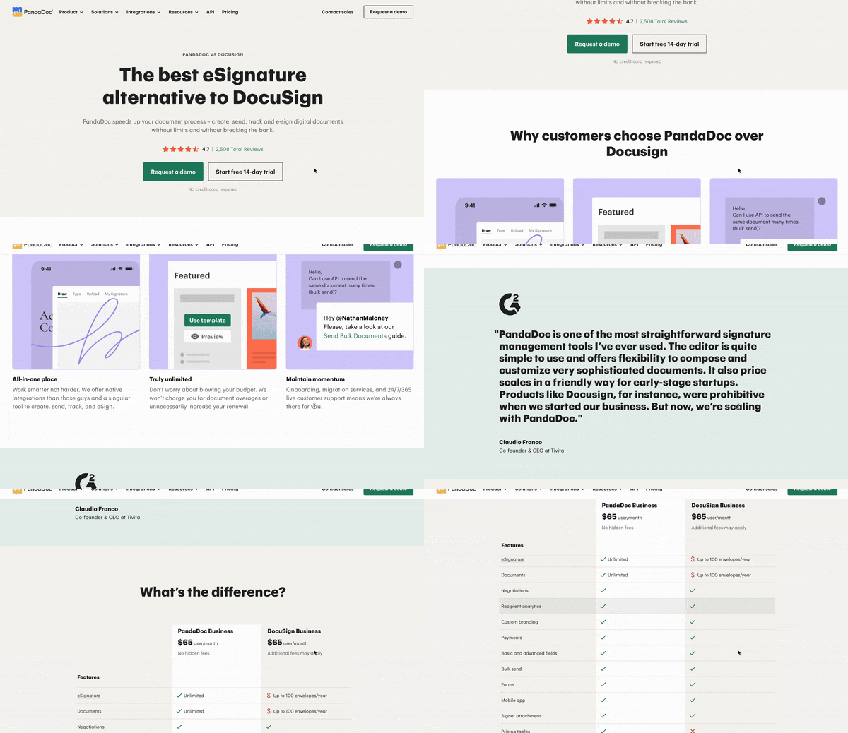
An example of how a comparison page looks like
Having a dedicated landing page comparing your product or service to your competitor’s can function as a deal breaker for prospects who’re in the final stages i.e. bottom of the funnel of the buying process.
Well-optimized competitor comparison landing pages can achieve conversion rates ranging from 3% to 10%.
But it’s not just restricted to the potential customers who’ve moved to the bottom of the funnel but also folks who are aware of the players in the market and need more evaluation of these products or services side-by-side.
Insightful competitor research isn’t just a way to showcase how your product stands against the competitors, but it’s also a treasure trove for driving SEO benefits for competitor keywords.
Let’s break down some of these benefits into more consumable points.
Benefits of competitor landing page
- Writing a page using your competitors’ info increases your surface area to potentially rank for keywords that your competitors rank for. Also, there’s a decent volume for “alternative” and “versus” keywords where people search for alternatives e.g. “ChatGPT alternative”.
- Many companies avoid targeting competitor keywords for various reasons - they consider it unethical, view it as too time-consuming, or lack sufficient information. This hesitation creates an opportunity, as ranking for these keywords can establish you as a trustworthy source of competitor information for potential customers.
- A competitor landing page helps people identify your competitors more easily, showcase why they should consider you instead, and help them understand where you stand in comparison to their other alternatives. To dive deeper into how to analyze competitor landing pages effectively, check out our guide here.
- These competitor product analysis pages are opportunities for you to demonstrate what makes you different. Do you have an edge in pricing, features, and support, or do you offer a solution to a specific problem? Competitor comparison landing page is your chance to bring the spotlight to you!
Now, let’s understand what makes a good competitor landing page.
Things to remember when writing a competitor comparison page
Competitor pages aren’t straightforward. There are quite a few things you’ll have to keep in mind/refrain from doing to structure a competitor comparison landing page that’s not only a reliable knowledge source but also stands by certain standards that might be easy to overlook.
Don’t be too full of yourself
Remember, a competitor comparison page should be an unbiased source of information for prospects and not a self-absorbed, elaborate blog on why someone should choose your product. People can read through even subtle exaggerations and overtly self-promotional posts might even leave them with a sour taste of your brand. You don’t want that.
The point is to state factors that organically favor your product and avoid boasting too much which can be rather negative.
It’s okay to highlight what makes your brand standout but don’t dwell on it too much. People who actually care about these comparisons are smart enough to understand the differences.
Similarly, don’t downplay your competitors
Comparison pages are not an opportunity for you to look down on your competitors or worse, talk about them in a derogatory manner.
Be transparent about what they offer. Even if it’s something you don’t offer, don’t hold back from mentioning it. People appreciate honesty and showing that you’re vulnerable about what your product might lack but actually embracing it can be something they remember you by. There are a lot of players in the market today and branding isn’t how it used to be. Even the slightest variations that highlight authenticity can uplift your brand.
Be true about the comparisons and don’t fabricate information to force a negative narrative about your competitors. It’s okay to talk about what the product lacks but not okay to look down on it. Talk about your competitors in the same way you talk about yourself.
Use formats that are easier to remember
Comparisons are easier to consume if they’re done in a format that helps visualize the differences without going back and forth. In fact, that’s the whole idea of having a comparison page - because you don’t want to switch between tabs desperately trying to remember information that’s not on the screen.
Use tables, visual guides, product screenshots, pricing tiers, gifs - anything that helps enhance the comparison to a level that can be comprehended without much effort. We’ll discuss examples of this in the following section.
What you shouldn't do is write comparison sections that look like a blog because it defeats the entire purpose. If you’re not making the user’s life easier through your comparisons, it’s not worth the effort to begin with.
Have good internal linking
Since these competitor comparison pages are a great opportunity to showcase your product, there will be a lot of instances where you can link and navigate your users to relevant resources. For example— if you’re looking for a marketing agency that can design winning landing pages for your ad campaigns, here’s our pricing plan. Still having doubts? Take a stroll through what our customers are saying.
This also means that you should link to all your other competitor pages from the current page or it should at least be a part of the layout of the page.
Enough talk. Let’s go through the examples.
5 examples of great competitor landing pages
Framer
Framer is a modern no-code web builder that lets users—technical and non-technical alike—build stunning websites with simple UI and low effort. The no-code market is booming and there are a lot of website builders that promise what Framer promises like Webflow, WordPress, Figma, etc.
Let’s take one of Framer’s comparison pages as an example.
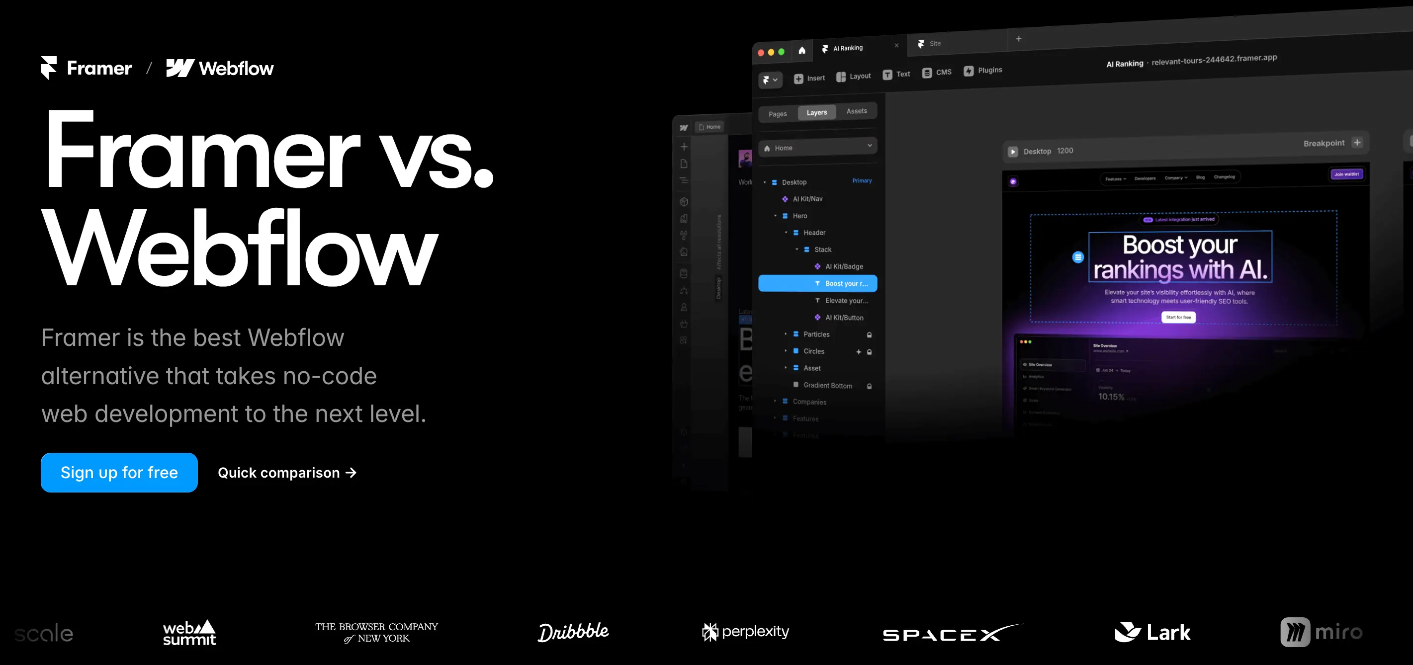
Framer’s comparison page that highlights what differentiates it from other competitors
Framer’s comparison pages are built like with elements like above the fold section (ATF), comparison features, and call-to-actions.

Framer’s comparison page shows up organically on Google
There’s the SEO angle in using keywords like “alternative” and “Framer vs. Webflow” which is what users search for. Sure enough, when you search for “webflow alternative” on Google, Framer’s comparison landing page shows up organically as the 3rd result.
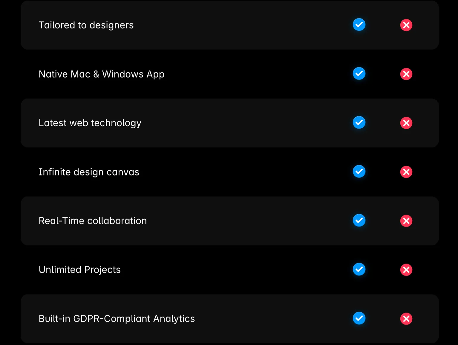
A tabular format comparison of why Framer is better than its competitor
The page follows a tabular format for easier visualization of the differences that make Framer ideal for web designers. For example: if having a native app on your desktop is a priority for you, then Framer is a better option than Webflow.
Another striking factor about the page is the customer testimonials. Not only do they talk about their competitive edge but they also back that with what customers have said about Framer’s upper hand.
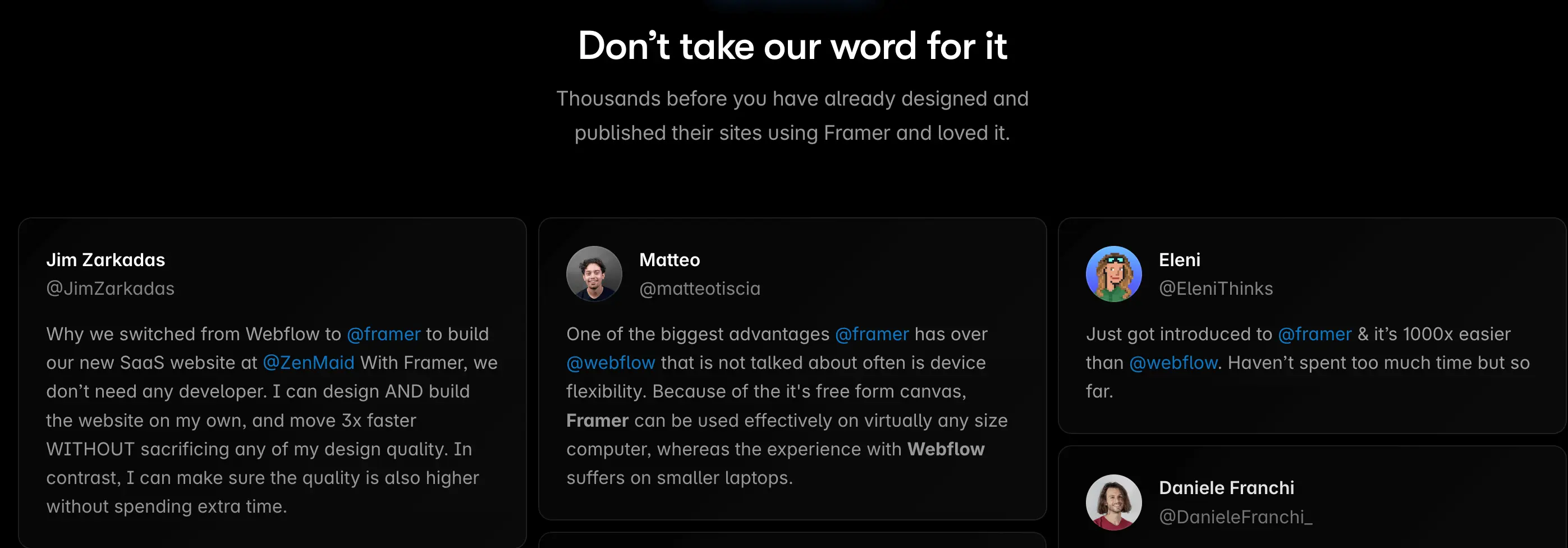
Customer testimonials build a trust factor for people looking for a solution
ClickUp
ClickUp is an all-in-one productivity platform designed to streamline work processes for teams and individuals. It offers a comprehensive suite of tools, including task management, document collaboration, whiteboards, time tracking, and dashboards, all within a single application.
See how ClickUp compares to one of their competitors, Monday.
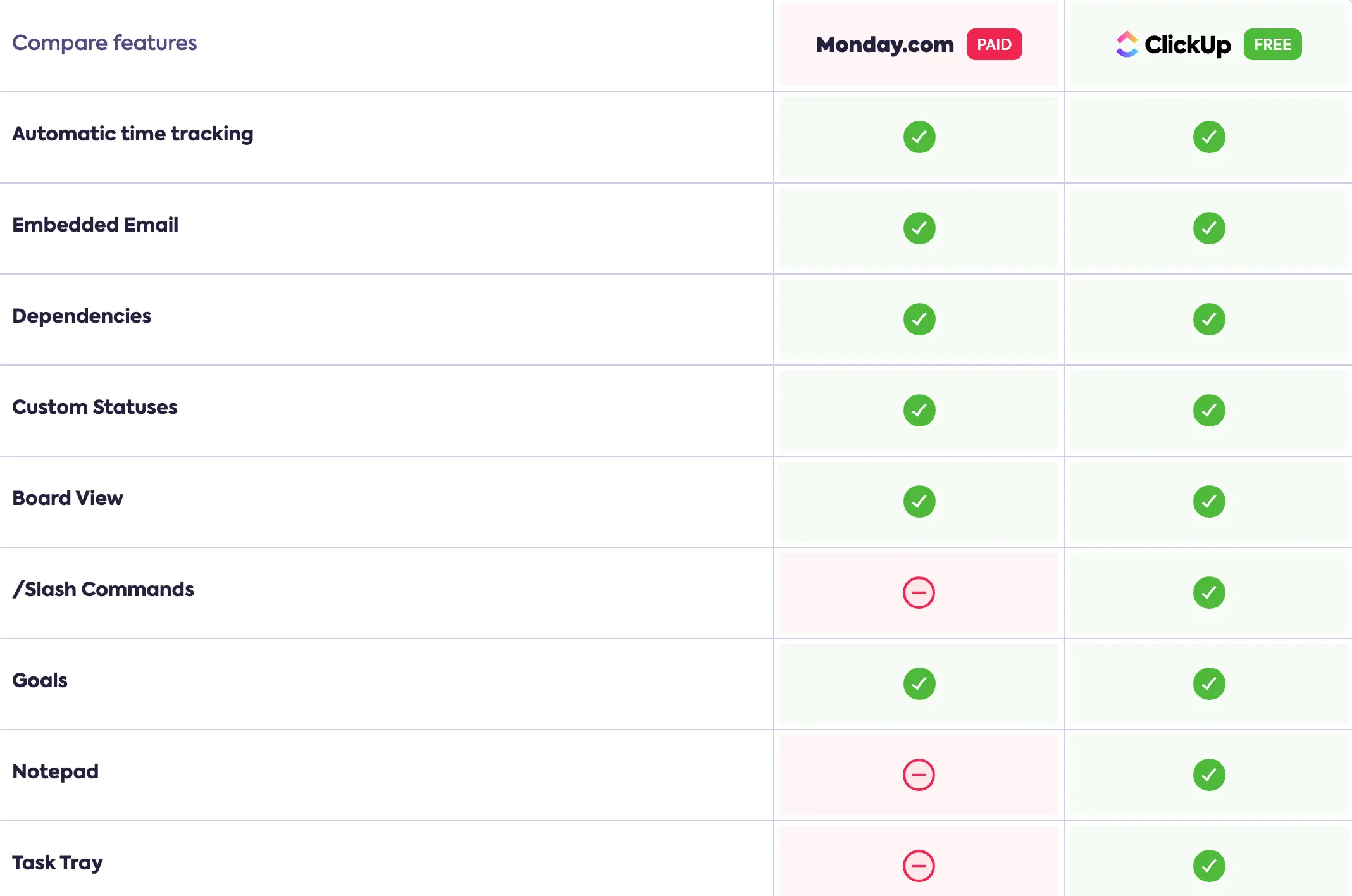
The difference in features as compared by ClickUp against Monday
ClickUp comparing its free features against Monday’s paid features stands out the most. This creates a notion or perception for the user that ClickUp offers more on its free plan than its competitors do on the paid one.
ClickUp’s competitor landing pages exemplify efficiency with simplicity. The page isn’t too design-heavy or content-intensive and only has an exhaustive tabular comparison with the competitors. Despite that, it does a great job of convincing users why it stands out.
Rippling
Rippling is a comprehensive workforce management platform that unifies HR, IT, and finance operations into a single system. It streamlines processes such as employee onboarding and offboarding, payroll management, benefits administration, and device management.
Rippling is another example of how you can convey compelling comparisons while keeping it simple.
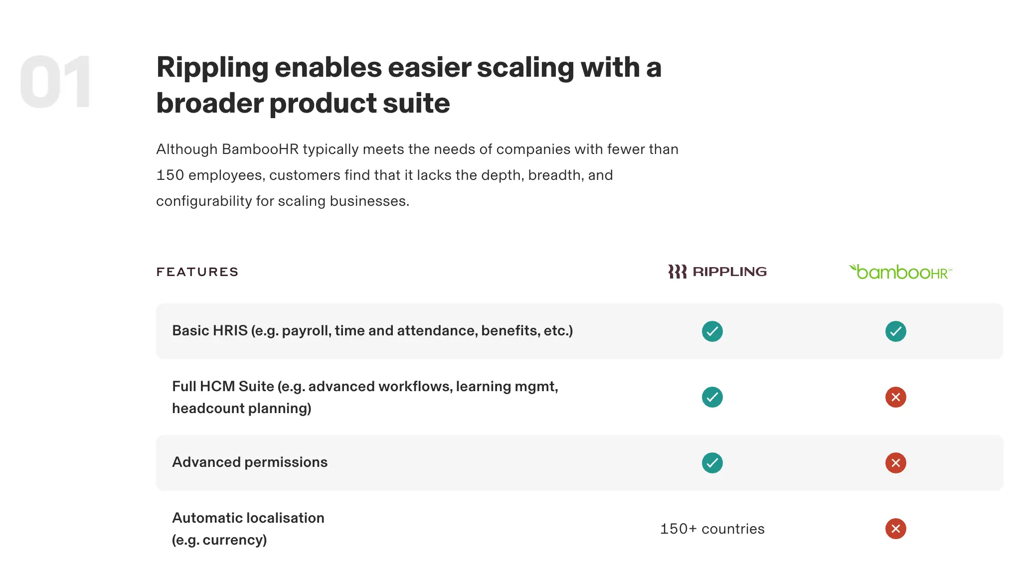
Rippling’s unique way of comparing features based on the outcome
What’s great about how Rippling compares is that it breaks down features based on outcomes that a prospect would expect. For example: here the features that have been compared in the table are specific to “enabling easier scaling” which would be an outcome a user would want from a product they invest in.
Not only does this help visualize these feature comparisons more efficiently, but also adds thought-out structure to how Rippling compares in terms of features and outcomes.
What’s more, Rippling has also added a G2 comparison scale to show how even the customer reviews favor Rippling over the competitor in question, BambooHR.
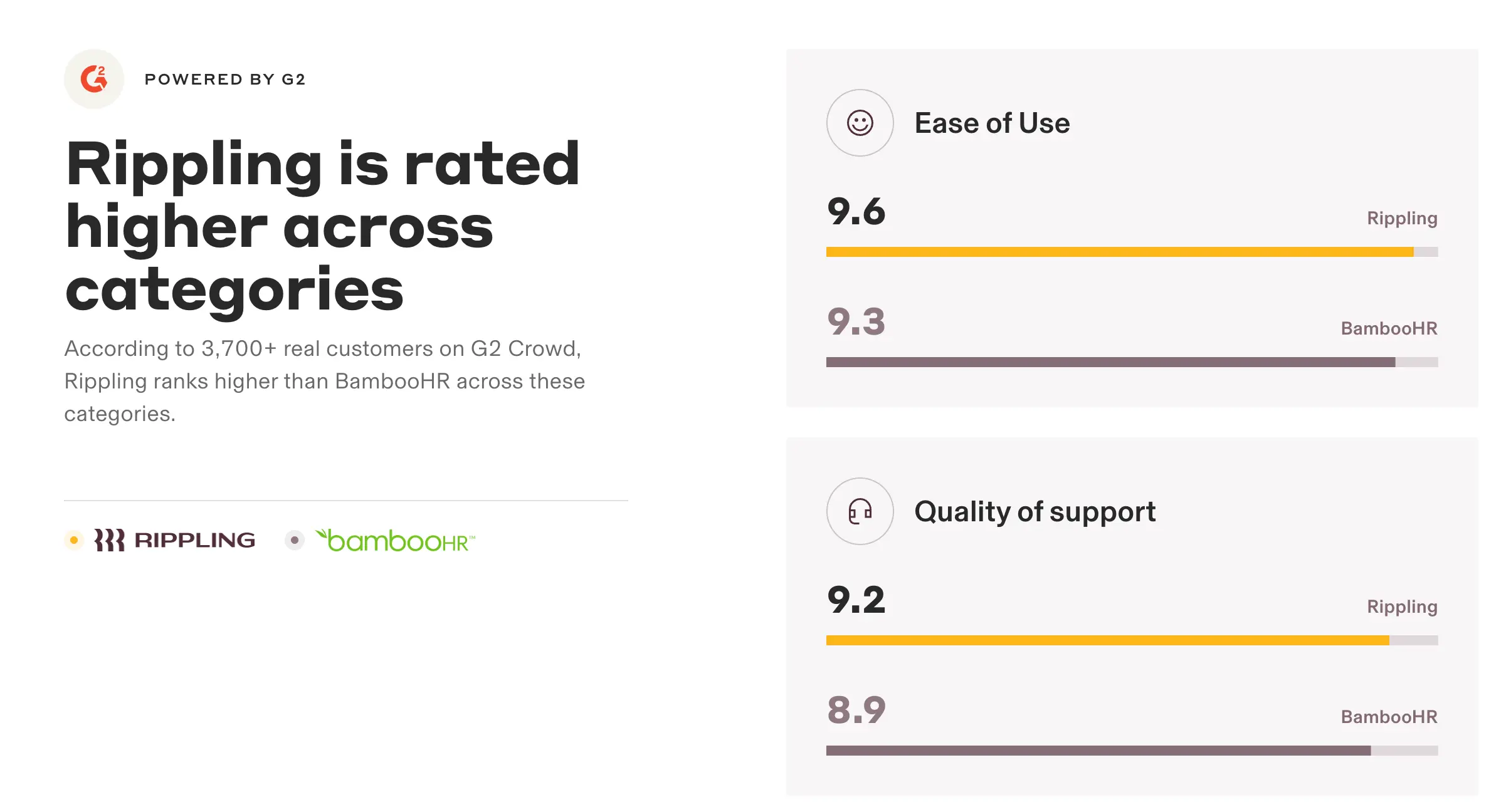
Rippling compares G2 reviews to showcase how are they better in certain areas
Loom
Loom is a video messaging platform that enables users to record their screen, voice, and camera simultaneously, facilitating clear and efficient communication. It offers features such as instant sharing, video editing, transcription, and integration with various tools, making it ideal for tutorials, presentations, and feedback.
So far we’ve seen that most comparison pages stick to the ‘checklist’ approach in their tables i.e. indicating whether or not that feature is present in their and their competitor’s product. Loom took a different approach to this by differentiating with a little more explanation.
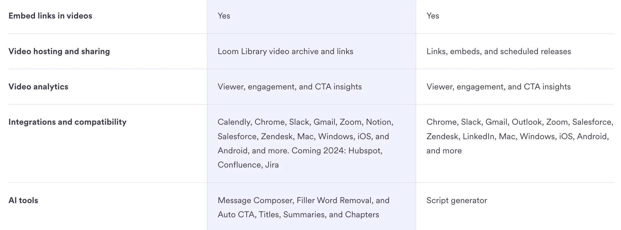
Loom chose a more descriptive way of tabular comparison which adds more flavor
From the table here we can see that Loom provides way more AI tools as compared to the competitor, Vidyard.
Loom, too, uses the G2 approach to compare how customers prefer them over Vidyard. Again the SEO angle comes into the picture with keywords like “Loom vs. Vidyard”.
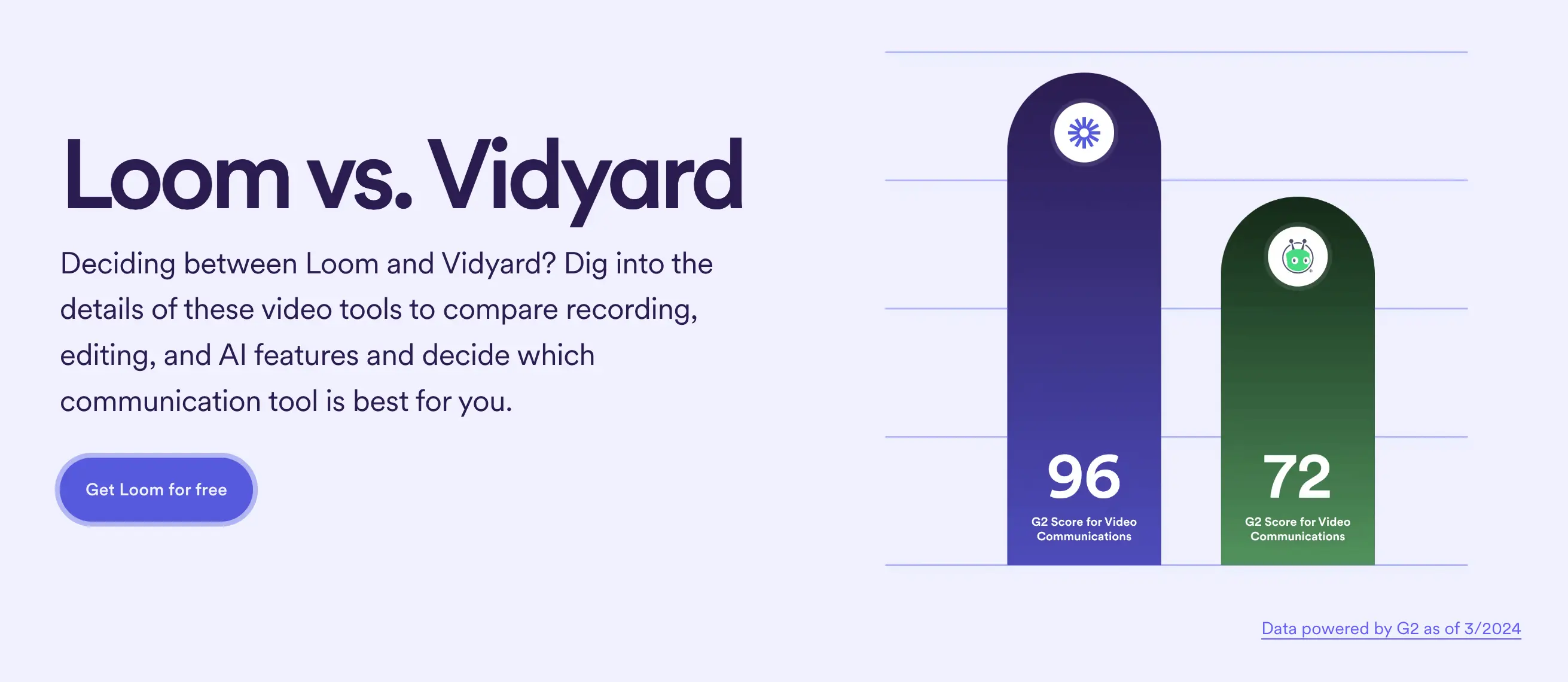
Loom’s comparison page uses G2 reviews as benchmarking their superiority
Briefly summarizing the differences in terms of “why choose X over Y” is another great way to distill the differences into skimmable content, highlight the major differences, and accentuate the deal-breaking factor as much as you can.

Loom’s brief description of why choose them over their competitors
Simple Analytics
Simple Analytics is a privacy-focused alternative to traditional web analytics tools like Google Analytics. In fact, they brand themselves as the best Google Analytics alternative.
We discussed earlier that comparison pages shouldn't be written like standard blog articles. However, this approach can work if you avoid making the content too text-heavy and include plenty of visual elements.
Simple Analytics has taken the blog approach but make it comprehensive and exciting to read with visual elements like tables, videos, creatives, and even memes.
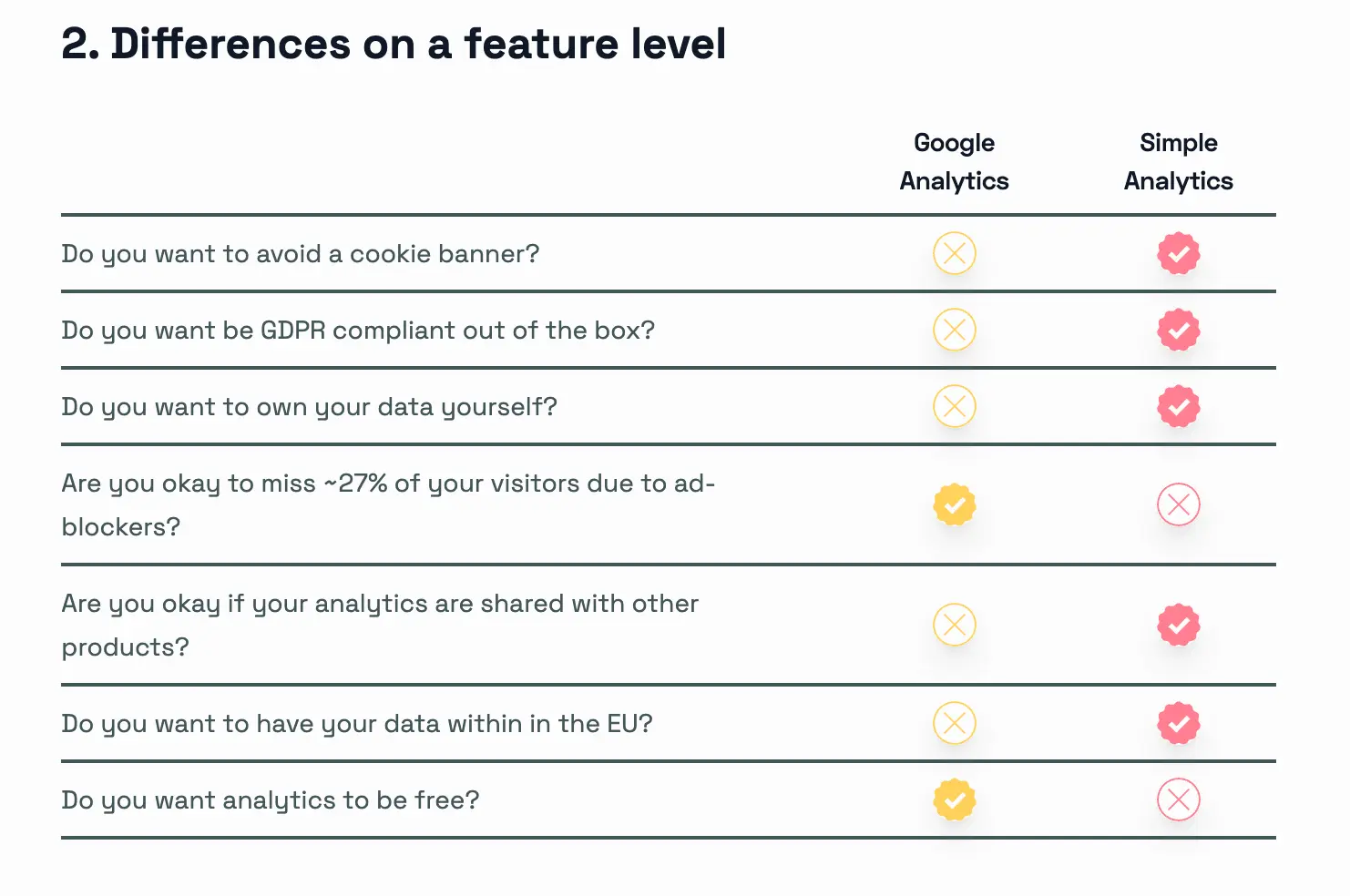
A tabular representation of the differences between Simple Analytics and Google Analytics
Another cool thing about how they did the comparison is through a side-by-side dashboard comparison. In this example, a user gets a single view of how the same data points are represented differently on these 2 platforms.
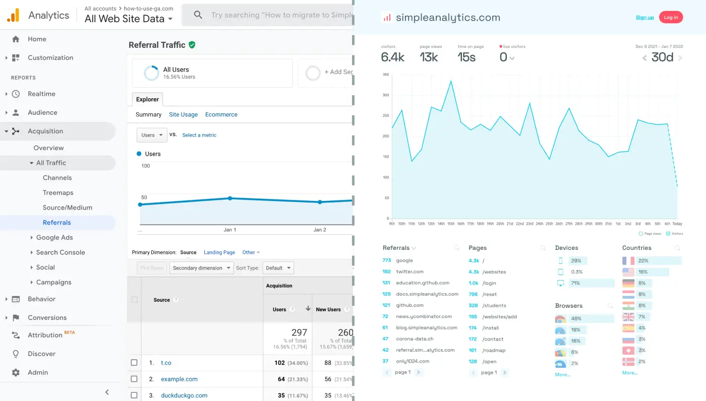
An example of how to do side-by-side comparison of dashboards
The cherry on top is how they end the comparison on a personal note. Though it’s very subtle, simple human touches like this help prospects make decisions. Even thought the CTA isn’t very prominent, it is definitely well-positioned with how the entire article has been written.
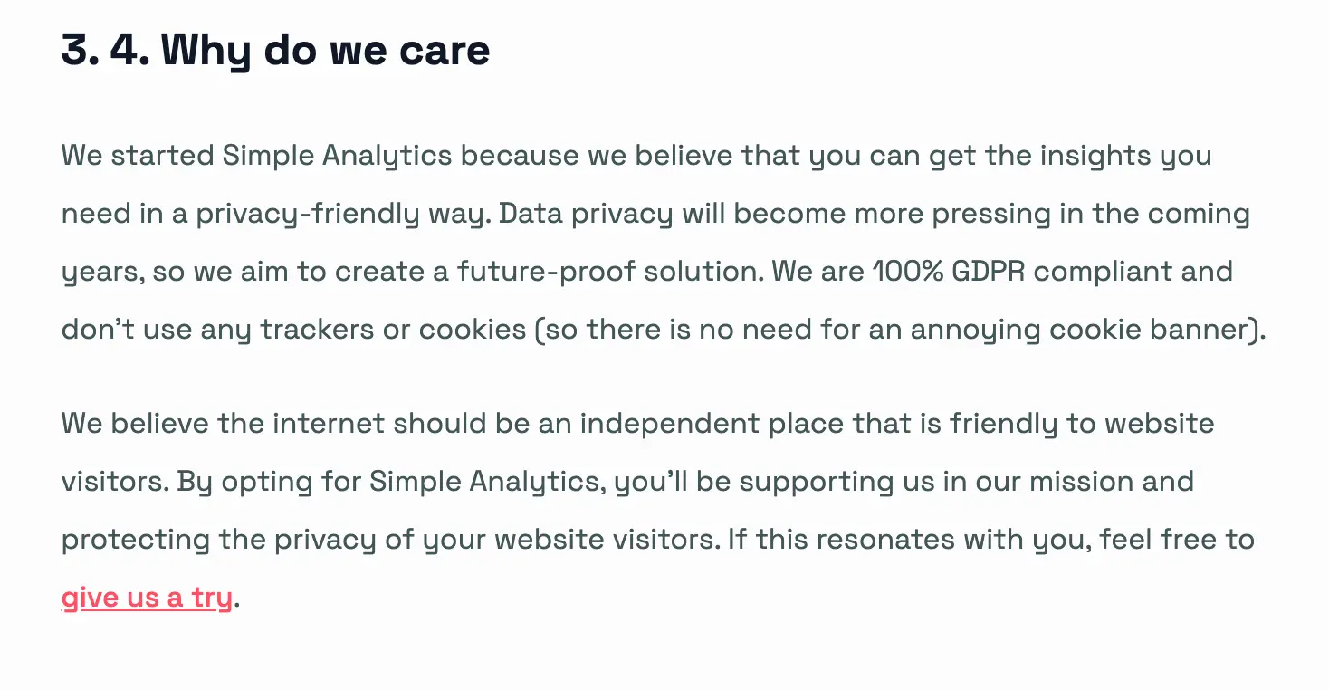
Adding a personal touch with a subtle CTA
Key takeaways from the 5 examples
- Use SEO-focused keywords like "alternative" and "versus" to drive targeted traffic.
- Highlight free features against competitors’ paid offerings to emphasize value.
- Structure comparisons around user outcomes or pain points for greater relevance.
- Incorporate tabular comparisons with added descriptions for easy understanding.
- Leverage customer testimonials to build trust and reinforce your competitive edge.
- Include side-by-side visual comparisons like dashboards for better visualization.
- Use creative elements like videos, memes, and animations to make pages engaging.
- Add G2 ratings or customer review comparisons to strengthen credibility.
- Create CTA sections that subtly nudge users without being overly promotional.
- Keep design simple but informative, prioritizing clarity over visual complexity.
How to create the perfect competitor landing pages: Best practices and actions
| Best Practice | Action Required |
| Objective & Intent-focused copy | Write a clear H1 like “Why [Your Product] vs [Competitor] is Worth It” that signals intent and sets unbiased tone |
| Unbiased and transparent positioning | Acknowledge competitor strengths; highlight both pros and cons of each side honestly |
| Deep competitor research | Use competitor product yourself, analyze their pages, then map nuanced differences |
| SEO-focused keyword targeting | Target long-tail terms like “[competitor] alternative,” “[your] vs [competitor],” and pain-point keywords |
| Dedicated pages per competitor | Build individual “one vs one” pages to improve clarity and relevance |
| Comparison table with key features & pricing | Use an easy-to-scan table with top ~8–10 differentiators and pricing info |
| Visual elements & product demos | Include screenshots, gifs or even short demo clips to illustrate features |
| Social proof & third‑party reviews | Add G2/Capterra scores, customer logos, quotes—especially from users who've switched |
| Easy migration guidance | Provide “switch” tips, migration steps, and data import tools |
| Strategic CTAs | Use repeated, clear CTAs (“Start free trial”, “Book demo”) with value-focused anchors (e.g., “Start your 14‑day trial”) |
| Internal linking & hub structure | Nest comparison pages under /compare/, link from footer and related comparison pages |
| SEO engine optimization | Apply schema markup for comparison tables, ensure mobile-first, include FAQ section, meta targeting of comparison queries |
| Honest & concise language | Keep copy clear, engaging, and succinct; don’t waffle or bury key points |
| Highlight pain‑point solutions | Frame differentiators around user needs (“faster load time”, “better collaboration”) not just features |
| Focused feature list | Prioritize your top unique value props—don’t overwhelm with every feature |
| Trustworthy supporting content | Show impartial study results or customer stories backing your claims |
| Visual clarity & intuitive layout | Design for scannability: use whitespace, columns, icons, competitor logos |
| Repeat & varied CTAs | Provide CTAs at top, middle, bottom (“Start Trial”, “Request Demo”, or “See Pricing”) |
| FAQ section | Add FAQs comparing both products to help educate and boost organic visibility |
| Monitor and iterate | Track SERP rankings, bounce/conversion rates; update content regularly for freshness |
Final thoughts
Writing comparison landing pages is undoubtedly one of the most content-rich and SEO-friendly things you can do for your website and company. From differentiating your product from your competitors to highlighting what gives you the edge — competitor comparisons will continue to remain relevant for a very long time.
How you choose to write these pages is your decision entirely but the purpose of this guide is to give you a blueprint or outline of some factors and examples to keep in mind when you do so.
FAQ
What is competitor analysis landing page?
How do I find competitors on Google?
Need help with anything?
Competitor landing pages are not just great organic engines for growth but also a great paid medium for users looking for alternative solutions. You can expand your surface area to get more traffic by running ads for keywords you couldn't use otherwise.
Paid media can help kickstart traffic to these comparison pages and help with organic growth in the long run. However, running ads is not that easy. And that’s what we’re here for. Our team specializes in driving growth through mediums like advertising, especially for startups.


