

Why is your landing page important?
You have approximately 3 seconds to grab a user's attention and about 50 to 60 seconds to sell your product.
Yes, that’s how long people spend on landing pages on average. And, if they don’t see what they like, you lose a potential customer.
According to a report by Gartner, about 48% of the people who visit your landing page don’t interact with any marketing collaterals and leave only after visiting the first page. That’s a very short window of opportunity for you to get that lead and the rest is your ability to nurture that lead or provide enough value with your product that no one else can provide.
Your landing page carries the weight of these factors:
- Your brand’s first impression
- Grabbing user attention enough to drive engagement and ensure return visits
- Ability to empathize with the problem as quickly as you can
- Ability to explain your solution as quickly and simply as you can
- Ability to rank in search results
The inability to solve these problems will knock down your conversion numbers by a lot. This difference in good and bad conversions could possibly be your landing page.
In the midst of this attention economy, most brands are struggling to get noticed but not really succeeding. Because, the most valuable currency today is attention.
Today's audiences have little patience for passive and inauthentic messaging. Rather than trying to manipulate them, you need to be direct while making your message compelling enough to earn their attention.
Users pay you with their attention in exchange for a solution to their problem. It’s as simple as that.
Apparently, the industry average for landing page conversion rate is 5.89% and about 10% is considered a good benchmark. What can you do to get there? Let’s find out.
Elements of a good landing page and how to write each
Which attributes describe a good landing page experience?
The elements that you put in it.
Think of your landing page as your brand’s first impression. The more time someone spends on the page, the more it shapes their perception of your brand. With each scroll, the likelihood of the user remembering your website becomes all the more apparent. By the end of it, the user has almost made their decision and your landing page design has a lot to do with it.
Each small element plays its part in influencing a user’s decision and maintaining that attention throughout. Here are some of the most common elements that define a landing page:
- Navigation bar or the nav bar
- Above the fold section or ATF
- Product features and showcase section
- The Call-to-action (CTA) or conversion action
- Footer
Of course, landing pages are not limited to these sections but these are the bare minimum. You can play around with these sections, experiment with them, and see what works for you.
Now, let’s dive deeper into each one of these sections along with examples to give you a sense of direction.
Navigation bar
The navigation bar (popularly called nav bar) is how people will get around on your website.
In its essence, the nav bar is crucial for designing a good landing page and website user experience. Even from an SEO standpoint, better internal linking and navigation give your website more credibility:
- Enhance user experience: A clear and intuitive navigation bar helps users find information quickly, reducing frustration and encouraging them to stay longer on your site.
- Improve accessibility: Consistent and well-structured navigation ensures that your users can intuitively understand, navigate, and interact with your website without getting frustrated or confused. This frustration is the leading cause of high drop-offs.
- Boost conversion rates: By directing users to key areas like product pages or contact forms, a strategic navigation bar (coupled with personalized conversion actions) can lead to higher conversions.
Typically, a good nav bar has the following elements in it:
- The logo that links to the homepage
- Product features
- Pricing
- Marketing resources & customers
- Call-to-action (CTA)
Here’s an example of a good nav bar:

Example of a good nav bar on Linear's page
However, a nav bar extends beyond what's immediately visible to include all the expanded menu items. Many websites pack their navigation with up to 100 nested links, creating a paradox of choice. This overwhelms users, leaving them unsure where to click.
For example, see what HubSpot’s ‘Solution’ drop-down expands to when you hover over it.
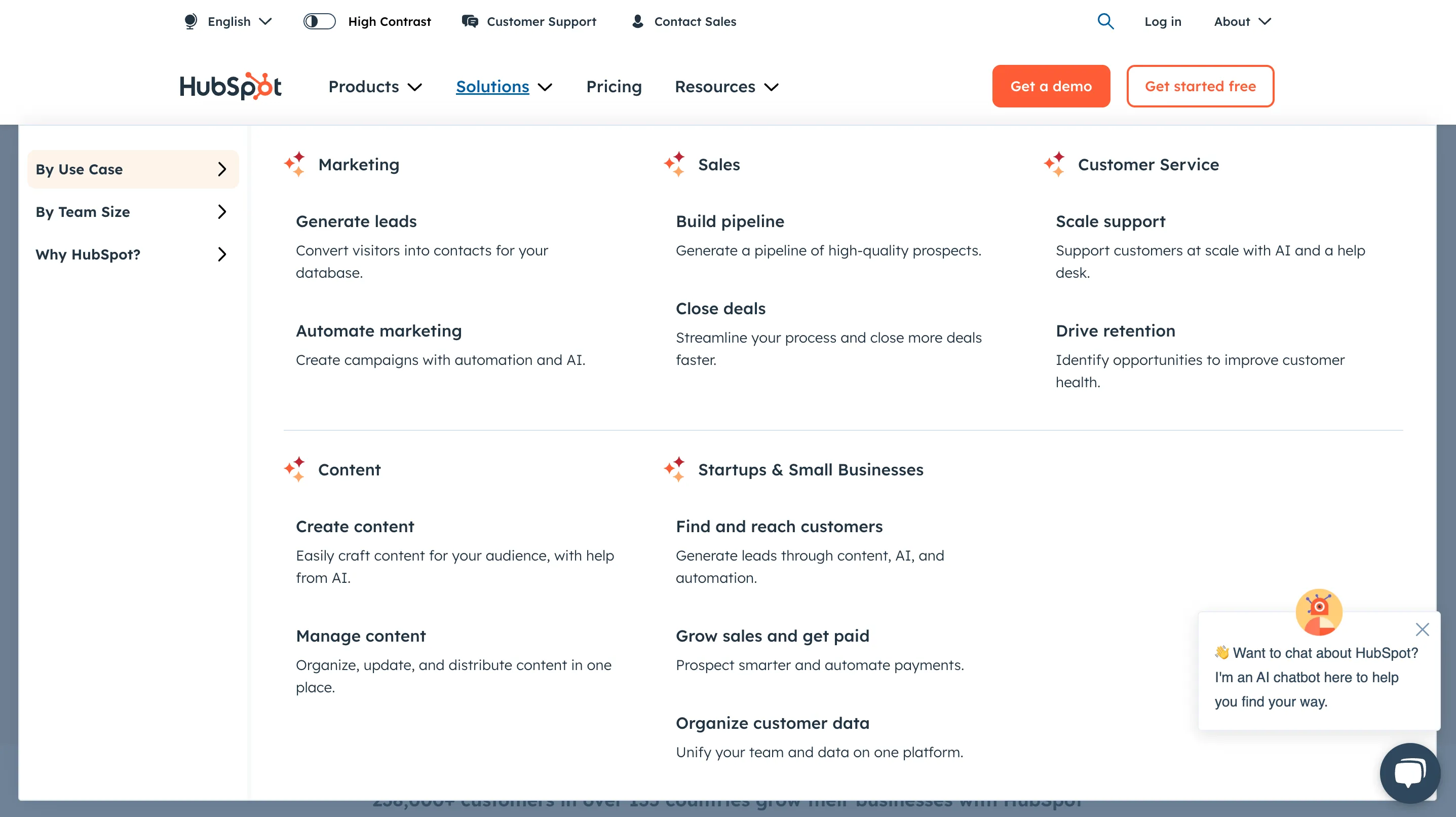
Cluttered nav bar navigation can be overwhelming for users
HubSpot's dropdown contains over 10 links under 'By Use Case' plus 2 more subcategories, which can overwhelm new visitors. While this extensive navigation works for HubSpot as an established enterprise platform, startups should opt for simpler navigation.
Going back to Linear’s example, see how concise their nav bar is:
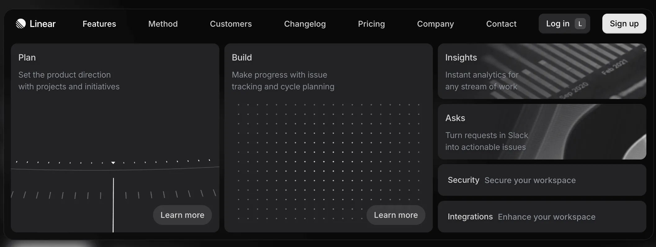
Linear’s navigation from their nav bar is concise and not confusing.
Their features drop-down has 2 primary links and 4 secondary ones. Linear is a tool that offers a dashboard for engineering planning and software development cycles and that’s properly communicated in the 2 links.
Some tips for creating an effective navigation bar:
- Keep it simple and clear; no jargon, no vague explanations.
- Limit the number of items to 5-7.
- Keep the same nav bar throughout your website. Be consistent.
- Be straightforward yet descriptive. Instead of generic words like ‘Service’ be more precise and say ‘Web development services’.
- The nav bar should be responsive across devices.
Above the fold (ATF)
Above the fold (ATF) section or HERO section is arguably the most important part of your landing page. Why?
- It’s the first thing a user sees when your page loads.
- Essentially, the first few seconds are when a user decides if they want to engage with your page any further or not.
- The very first information you share with them is used to assess if you’re a fit for them or not.
A bad ATF is one of the primary reasons for people to drop off.
Typically, a good ATF would have the following elements in it:
- A headline that clearly communicates what the product does.
- A description that further explains the product and what it does but still in simple terms.
- A design that’s welcoming, enticing, and intriguing.
- Social proof i.e. establish trust by showcasing your customers.
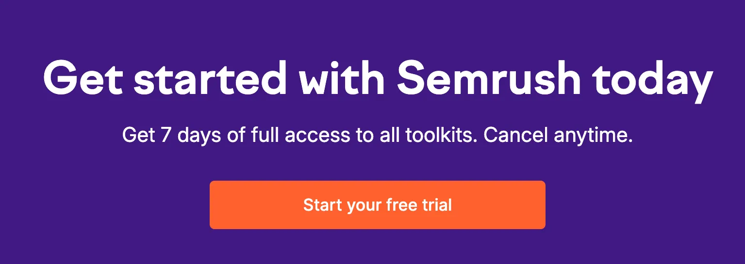
Let’s take an example of a good ATF:
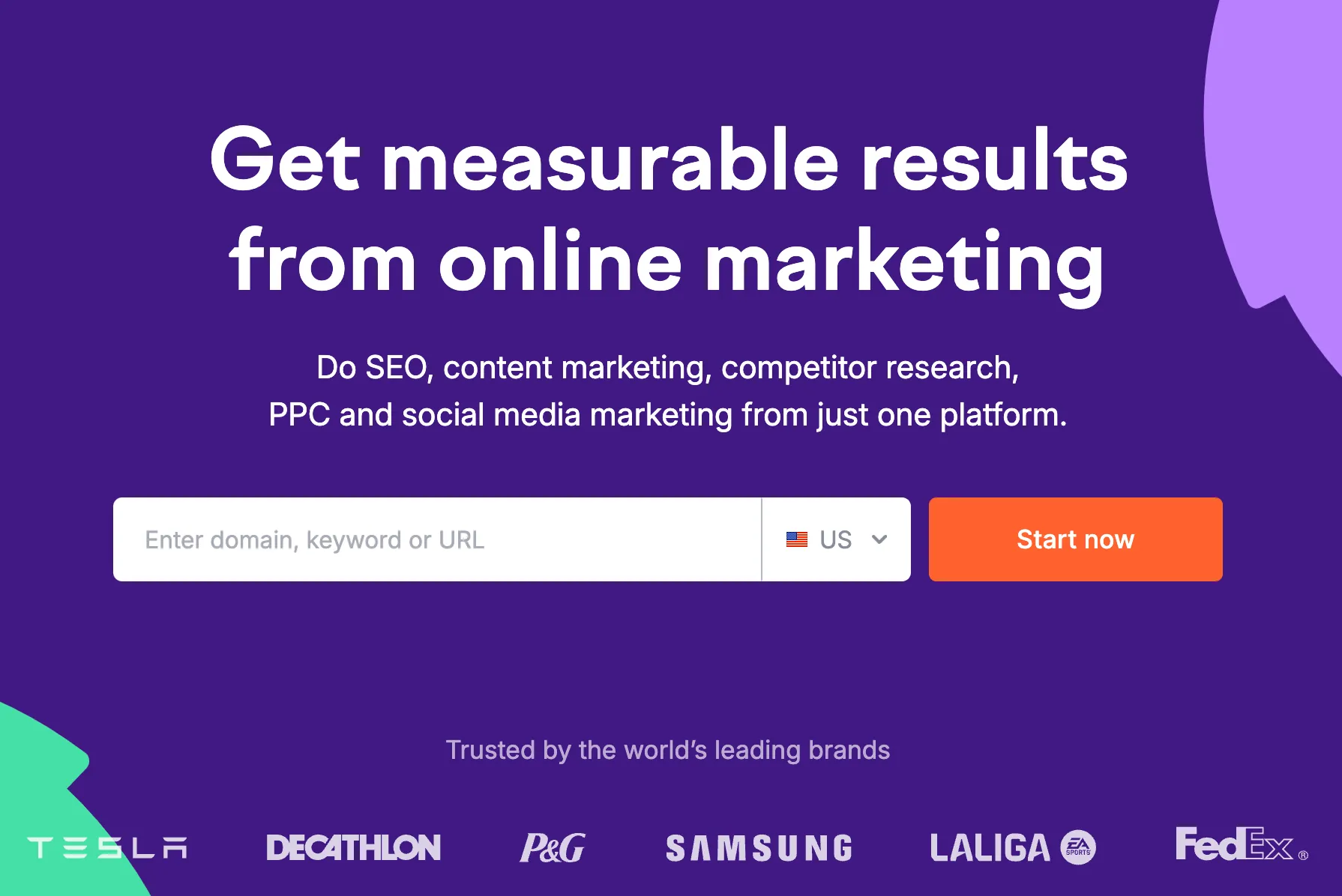
Semrush’s landing page is a good example of an ATF section
In the first 5 seconds, you get to know the following critical information:
- It’s a tool that helps us identify opportunities through marketing metrics.
- An all-in-one platform for everything related to marketing: SEO, Content, Competitor research, PPC, and social media.
- Global brands like Tesla, Samsung, etc., use Semrush. So they must be using it for a reason.
- On top of that, their CTA doesn’t ask you to sign up but rather directly prompts you to enter the domain, keyword or URL to get started. Users see more value in this and signing up becomes more probable.
In a nutshell, Semrush describes everything you need to know about their product. Any other information you need, you will look for it yourself. Whether you convert or not as a user is your choice but at least they have your attention now.
The most important thing to keep in mind is to keep the messaging as precise as possible, without any vague words with subjective meanings. Your product’s primary headline should be the objective truth and nothing confusing.
Consider a company that’s a digital platform for buying and selling used firetruck equipment. Now, instead of being vague and saying “Modern problems need our solutions” be completely upfront and say “Buy and sell used fire equipment”. This is what the startup, Garage, has as their unique selling point (USP) on their ATF.
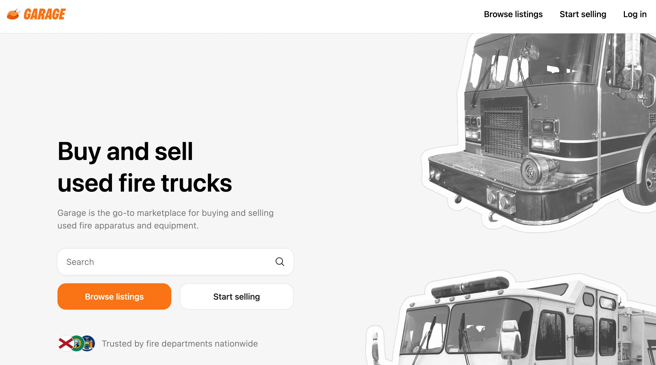
Garage clearly communicates their USP
On the other hand, Landed’s ATF can be improved a bit. Let’s do this exercise together.
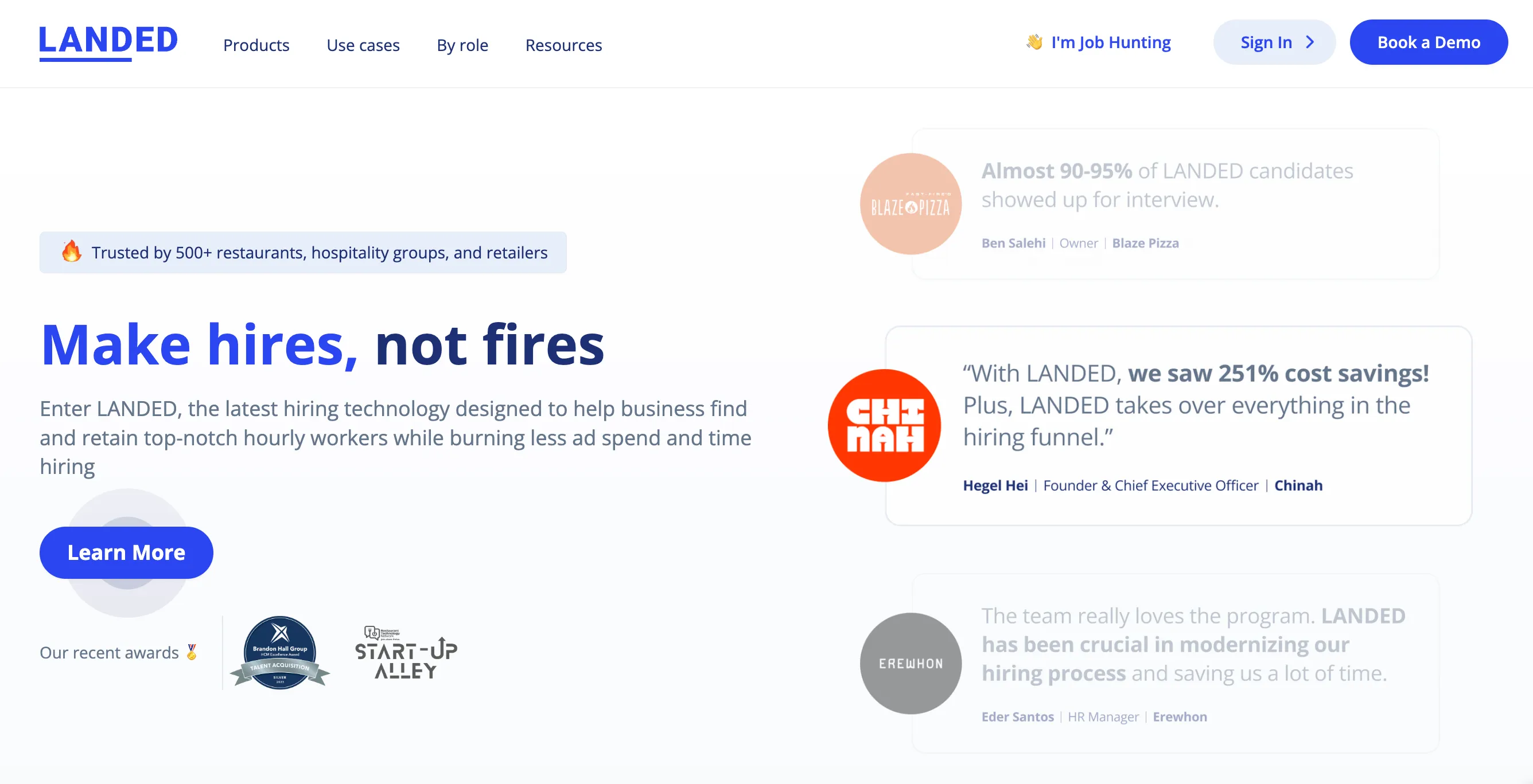
Landed’s headline is vague and doesn’t convey their USP
Landed is a platform that helps companies improve their hiring process by offering vetted candidates who are more likely to convert and be good at their jobs.
The headline “Make hires, not fires” doesn’t highlight this message at all. It could be productivity software, an edtech platform, or an HR tool–the message isn’t leveraging what the company can really do.
What could be a better headline for them?
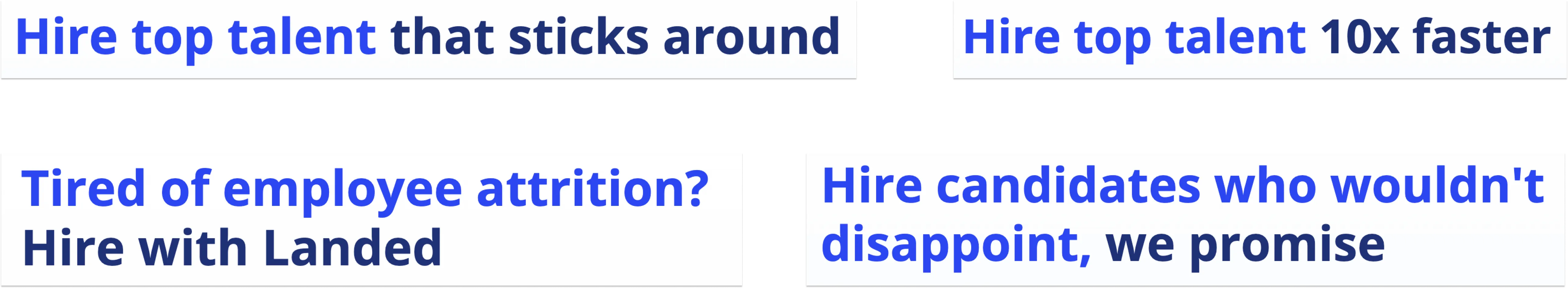
Headline options for Landed’s ATF section that might be better
Also, the subheader or description is good but it might be better if they highlight a problem first and then the solution. For example:
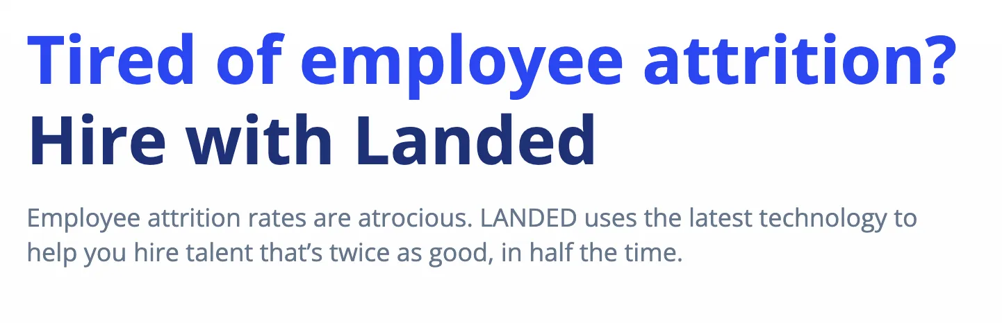
Example of what an updated headline and description might work better for Landed
Some suggestions to write good ATF sections:
- Don’t boast about your product. Rather explain exactly what it does and the benefits you can get from it.
- There’s a product for everything in the market today. Be as specific as you can about what you bring to the table.
- Highlight pricing if necessary or if it helps you stand out. Example: Become a data engineer with $3,000.
- Don’t be repetitive. ATF occupies the most (figuratively) expensive space on your website, don’t waste it by being boring.
- If you’re aware of a common problem your target audience has, highlight it. Example: Can’t find internal docs? Use our AI and get it in seconds.
- If it aligns with your brand persona, choose to talk to your audience directly instead of being indirect. This improves personalization.
- Similarly, talk about your brand in the first person. Example: instead of saying “The company offers a 2-week free trial” say “We offer a 2-week free trial”.
Features and descriptions
After a user moves past the ATF, it means not only that your product is relevant but also that they’re interested. You now have their attention.
The features section comes next. This is an opportunity for you to elaborate on your product or service with 3-5 key features. These features should define what you offer in a nutshell so you need to be economical with what you choose to say here.
Again, lengthy and jargon-laden product descriptions are a thing of the past. People want ‘skimmable’ content now that can be consumed in seconds but still be understood.
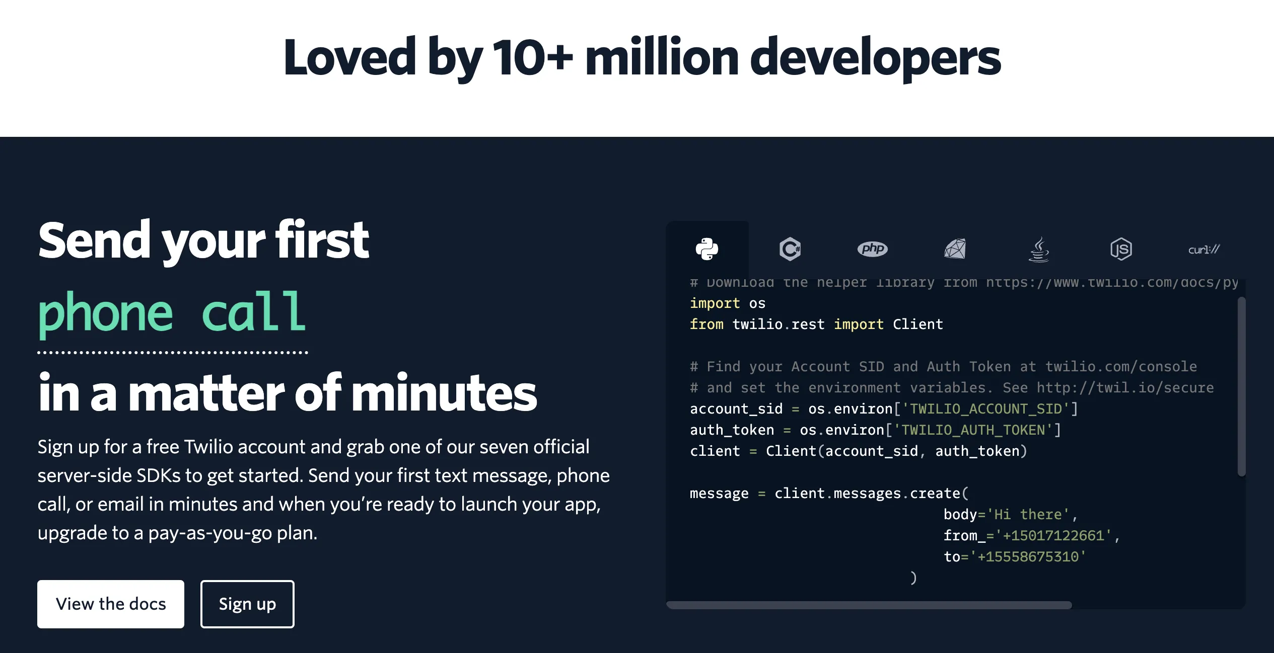
Let’s take Twilio as an example. Twilio is a platform that provides developers with tools to integrate communication channels like messaging, voice, and video into their applications. Their features section starts with this:
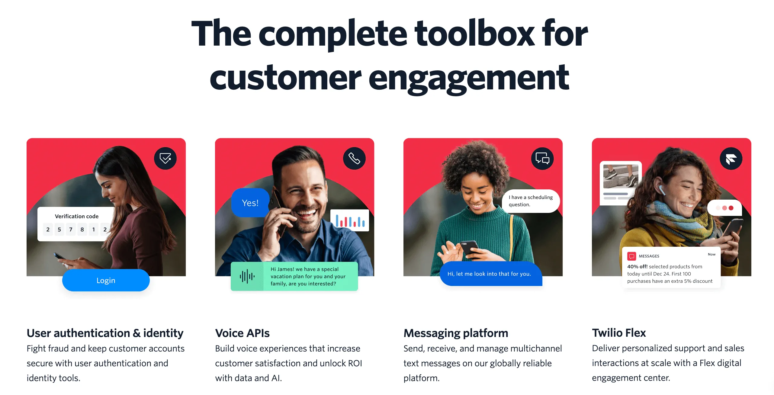
Example of a good feature page
Having the features and use cases do the talking helps in two ways:
- The audience doesn’t need to spend much time comprehending what the product is about.
- They can easily visualize the value that they will receive from the product.
After introducing the features, they emphasize their platform's popularity, showcasing its adoption by over 10 million developers. This helps with boosting credibility.
Additionally, they highlight ease of use, such as enabling users to send their first phone call or text in a matter of minutes with simple SDKs.
Credibility boosted by the usage of quantitative information
No fluff words, no exaggerations, no jargon–just plain explanation of what the tool does for the Sales team. Simple.
Remember to give the page some personality by adding images, creatives, infographics, or even gifs that help visualize the product further. Brand themes and design also help extend the narrative of your company and tie the whole thing together to keep the user interested.
Some suggestions for writing a good features section:
- Be confident in the claims you make. If you’re writing statements like “ ‘the fastest tool for resolving bugs’ then you need to be able to back that claim with data. But don’t be afraid to be bold about it.
- On the other hand, don’t promise something you can’t give. Be as transparent as you can about the product.
- Don’t overcomplicate or oversimplify things. Take help if you need from a professional to write copy that delivers exactly what needs to be said in the right amount of words.
- 2 sentences are usually not enough to explain a feature or a service. The landing page is the showcase for each feature. Link the features to their individual pages or have a personalized CTA where you can explain that feature in more detail.
- Ensure the navigation isn’t broken.
- Make use of numbers, customer testimonials, case studies–anything that gives your company more credibility.
Call-to-action (CTA) and Conversion actions
CTAs are how conversions happen. When a user likes what they see on the page, they move ahead based on what your CTA is. There can be many kinds of conversions on landing pages, some of the most commonly used ones are:
- Signing up for a demo of the product.
- Starting a free trial for the product and exploring it for a limited time.
- Downloading an app or the tool on your device.
According to HubSpot’s survey, personalized CTA converts 202% more than default CTAs. So your visitors are more than 2x likely to convert if you personalize and add some intent behind the CTAs on your landing page.
Semrush’s CTA is personalized and enticing to start using the tool right away
Going back to Semrush’s example, their CTA does 3 very important things on the page:
- Makes the user curious about what will be shown to them if they enter a domain, keyword, or URL.
- The CTA itself reads “Start now” which lets the user know that they start right away without any formalities.
- It doesn’t ask for the user’s email right away. It offers you value before asking to sign up. Not a lot of brands do this.
Offering something valuable in return for a signup should be your first priority while writing CTAs.
Finally, the landing page should also end with an ending CTA that binds the entire page together and is sort of a ‘nail in the coffin’ to raise the chances of a conversion.
Another example of a good CTA is the one that uses numbers to make a final impact. Airtable does this well:
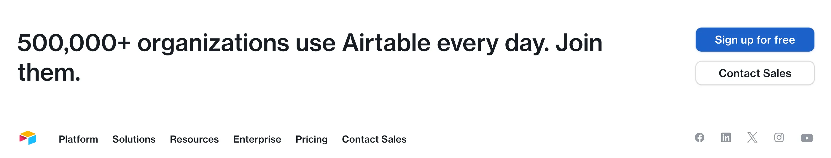
Airtable’s CTA that highlights a number to nudge conversion
Softr is another good example of this:
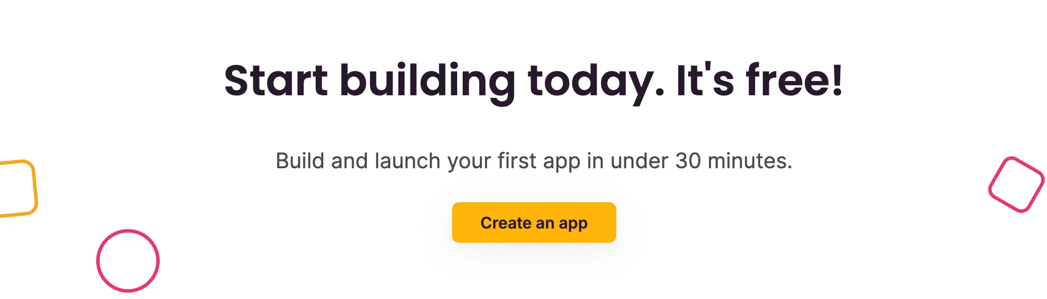
Softr’s CTA on the page is simple and recalls their USP
Some suggestions to write a good CTA:
- Personalize the CTA based on what you’re offering and for the specific target audience.
- Be subtle with your CTA–don’t overdo it and yet don’t leave your visitors searching for a CTA that’s hard to find. It should blend with the content and not feel forced.
- Don’t ask for too much i.e. your landing page CTA should be short and offer value in return for their email address. If you have a form, don’t have more than 4 fields marked as necessary.
Footer
Footer sections are often overlooked because they are the last thing a user sees on your landing page. However, footer sections can be a haven of interlinking opportunities and help interested users navigate to other pages on your website.
A lot of people think that if a user makes it all the way down to the footer section, it’s alright to stuff as many links as possible because they wouldn’t end up here if they weren’t interested.
That’s not true. The footer needs just as much structure as the nav bar and you need to be selective of how many links you add here.
A good footer consists of the following:
- Links to important resources and documentation that highlight your marketing collaterals and knowledge base.
- Social links.
- “Careers” “Company” or “About Us” page to humanize your brand and let users know about where all this comes from.
- Links to product features, use cases, industry-specific solutions, etc. that might be enticing for the user.
- Legal, consent, copyright, or security documents (if any)
- Competitor comparison pages (if any)
Let’s look at an example of a clean yet informative footer section:
Demand Curve’s footer is clean and doesn’t clutter with too many links
Demand Curve’s footer has only the resources they want you to check out, nothing more, nothing less.
Now, Softr’s footer section is quite overwhelming at first glance. Again, the paradox of choice takes hold and the user ends up scrolling away in a lot of cases.
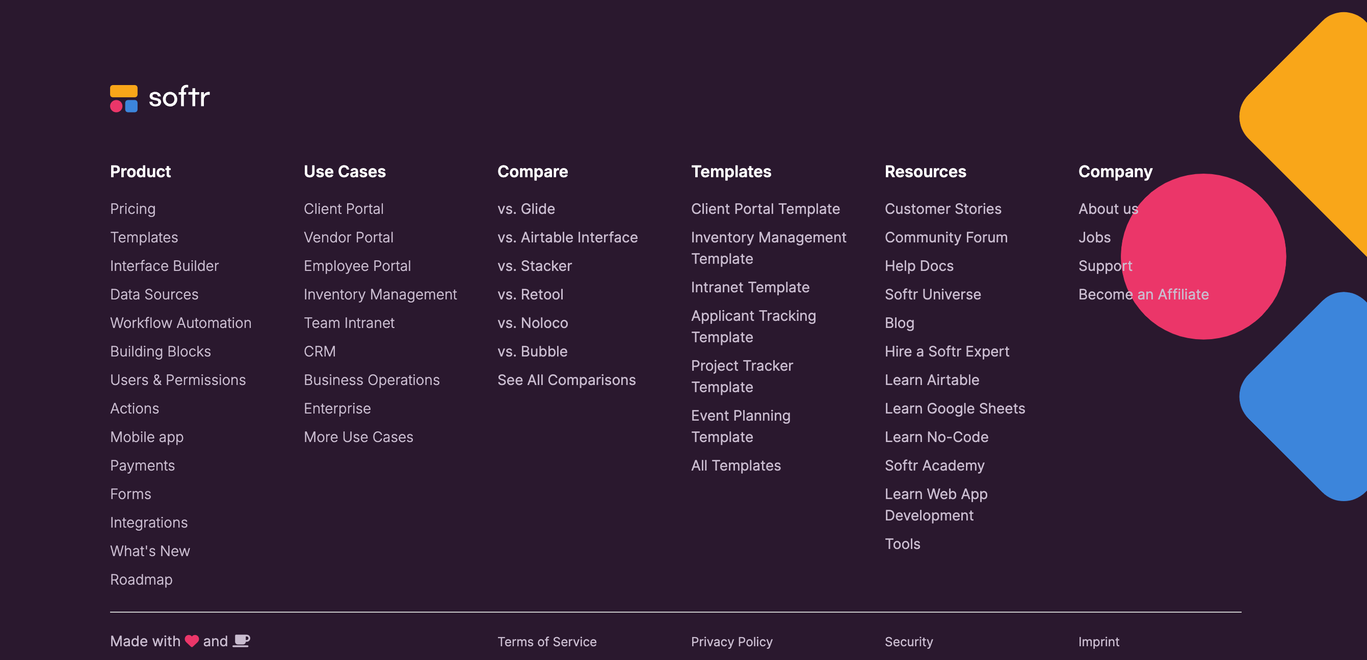
Softr’s footer section is a bit cluttered and overwhelming for visitors
You might notice similar footers for larger enterprises like Salesforce or HubSpot but, at this point, they have tons of resources and they can be more lenient on their footers as compared to smaller startups.
Softr doesn’t need to have that many links. In fact, it might even be less effective.
As a startup, you might not have that many links to begin with but you have to be careful of what you add to your footer as those links increase. Be tactical about where you want your users to end up on the website. You can essentially influence how you want users to navigate the website in the most ‘conversion-probable’ manner.
A few other things to keep in mind
- There’s a lot you can learn from analyzing your competitors’ landing pages. It gives you insights into how have they shaped their brand, messaging, tone, problem statements, and solutions.
- If you’re planning to run paid advertising for your landing page, the ad copies should be relevant to the content on these landing pages. A mismatch between what the ad implies and what the landing page suggests will lead to more drop-offs and diminishing ad performance.
- To begin with, duplicate the ad copies or even the landing page to make minor changes that tie both of them together.
- Always keep SEO best practices in mind–optimized images, headlines, meta descriptions, and technical SEO stuff like internal linking, sitemaps, and page load time.
- Optimizing page load is the backbone of healthy SEO practices. If your website doesn’t load in less than 3 seconds, all that work you put into designing and copywriting will go to waste. Remember, people won’t wait for your page to load.
- Page responsiveness is another significant factor. More than half of all traffic comes from mobile devices. A page that isn’t designed to be responsive will most definitely turn visitors away.
FAQ
What is a landing page?
Why do you need a good landing page?
What is competitor analysis landing page?
What we can help you with
This may seem overwhelming at first.
While designing web pages and websites from scratch is challenging, it doesn't have to be complicated.
The best approach is to keep things simple and iterate based on data-driven insights. With this mindset, the rest will naturally come together.
Or, you can also seek professional advice and help from people who’ve been doing this long enough to understand the nuances. We helped Hona, a customer of ours, get 62% more leads at a 64% lower cost. Being a new player in the healthtech space, Hona needed to establish trust with their target audience while going up against competitors who’ve been in this space much longer than they have.
This is what we did for them:
- Redefine their website messaging after identifying unique selling points (USPs).
- Redesigned the landing page content, design elements, and personalization.
- Helped them see better Click-through rates with optimized ad copies.
With the right mix of strategy and execution, competitor landing pages can become powerful engines for both organic growth and direct conversions. And we’ll help you write such landing pages that convert.